Advanced Research
Platform Redesign
Redesigning LSEG Workspace's Advanced Research tool — a complex document discovery and analysis platform used by 40,000+ financial professionals globally — to reduce search friction, improve discoverability, and unlock faster insight for analysts and portfolio managers.
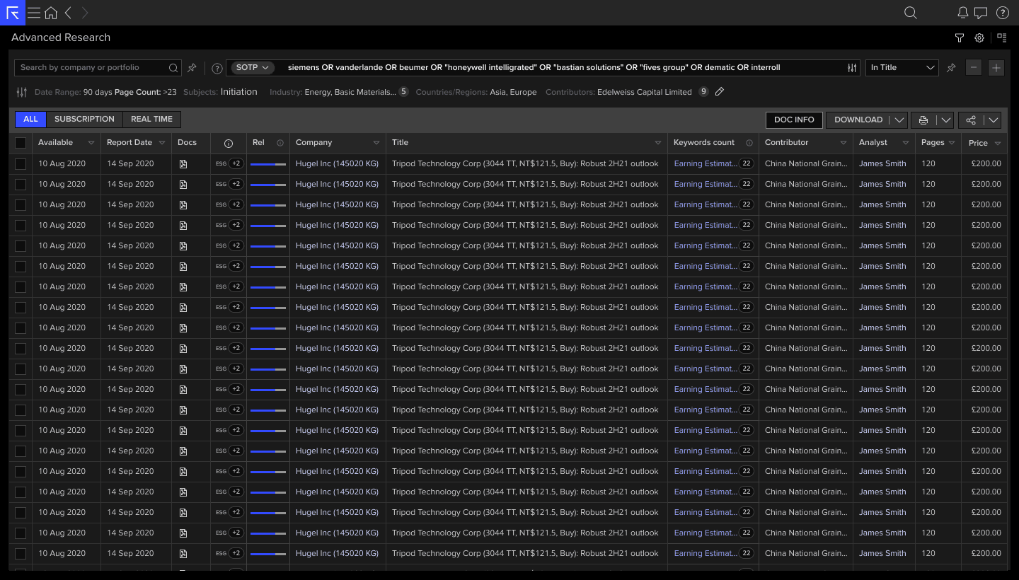
Advanced Research — results table with Boolean search, relevance scoring, ESG tags, keyword count, and bulk download actions.
01 — Problem Statement
The tool didn't match how analysts actually research
LSEG Workspace's Advanced Research (ADVRES) module gave access to hundreds of thousands of equity research documents — initiation reports, SOTP analyses, earnings estimates, sector deep-dives — from thousands of global contributors. The data was unmatched. The experience was not.
User & domain analysis revealed that analysts follow a consistent mental workflow when researching: they start with a broad investment question, progressively narrow it into a structured query, scan results to assess relevance, shortlist candidates, and finally examine selected documents in depth. ADVRES was designed around a flat search-and-table paradigm that cut across every step of this workflow — forcing analysts to hold the entire research process in their heads rather than having the tool support it.
The redesign challenge was to make ADVRES understand and support this workflow end-to-end — removing friction at every transition point, so analysts could move fluidly from question to insight without fighting the tool.
Redesign ADVRES around the analyst's natural research workflow — supporting query formulation with structured guidance, accelerating result assessment with inline relevance signals and keyword context, and streamlining document examination and bulk export — so analysts can move from investment question to insight in a single, coherent workspace.
02 — Research & User Interviews
Understanding how analysts actually search
We recruited 14 participants across buy-side analysts, sell-side researchers, and portfolio managers — ranging from power users who built complex SOTP models to occasional users who just needed a quick initiation report. Research was conducted via remote moderated sessions and contextual enquiry at two client sites in London and Amsterdam.
What analysts told us
“I know the research is in there somewhere. But constructing the right search takes longer than it should — so I end up just emailing the contributor directly.”
— Buy-side Analyst, UK Asset Manager
“I need to see the keyword in context. Right now I just see a count — 22 matches — but I have no idea if they're relevant until I open the document.”
— Research Analyst, European Investment Bank
“I want to download the first pages of 30 reports and read them on the train. That workflow doesn't exist — I'd have to open each one and print manually.”
— Portfolio Manager, Global Asset Management
- →Only 23% of users were aware Boolean search operators were supported in the query field
- →Filter panel was hidden below the fold on 1280px screens — 41% of users never expanded it
- →Keyword count column was the most-clicked element, but the tooltip only showed totals — not excerpts
- →78% of multi-document download tasks failed or were abandoned in usability testing
- →Column settings had never been used by 60%+ of regular users — it was invisible in the UI
03 — Ideation & Low-Fidelity Prototypes
Sketching the search experience
Findings fed into a structured ideation sprint with the product team. We ran a two-day workshop focusing on three core opportunity areas: search transparency, results triage, and bulk workflow actions.
Lo-fi wireframe — inline keyword preview on hover, progressive filter bar, relevance bar column
Three core design principles emerged from ideation: progressive disclosure (surface power features only when users signal intent), contextual confidence (show why a result matched, not just that it did), and batch-first actions (design bulk workflows as first-class, not afterthoughts).
04 — User Testing Outcomes
Two rounds with financial professionals
We ran two rounds of moderated usability testing using a high-fidelity Figma prototype. Participants were given realistic tasks — constructing a SOTP screen for a logistics sector report, downloading a merged morning briefing, and customising their results columns — mirroring actual day-to-day workflows.
- ✓Replaced hidden filter panel with always-visible summary strip showing active filters as chips
- ✓Added inline keyword preview tooltip on hover — showing page number and surrounding context
- ✓Surfaced column settings as a persistent icon in the table header (not buried in page settings)
- ✓Introduced query builder helper with Boolean operator suggestions for first-time users
- ✓Redesigned Download dropdown with three clear options: Separate Files, Merge, First Pages Only
05 — Final Design
Advanced Research — shipped
Here are the final screens shipped to 40,000+ LSEG Workspace users across global financial institutions.
Results table — compound Boolean search, SOTP filter, relevance bars, ESG indicator tags, keyword count, contributor and pricing columns.
Expanded Filter Panel
The always-visible filter strip replaced the hidden panel — giving analysts access to all 8 filter dimensions without hunting for them. Subjects/Topics, Industries, Countries/Regions, Analysts, Time Period, Pages, Report Types, and Contributors are all accessible in one row, with active filters shown as persistent chips. The "Last Run" timestamp tells analysts exactly how fresh their results are.
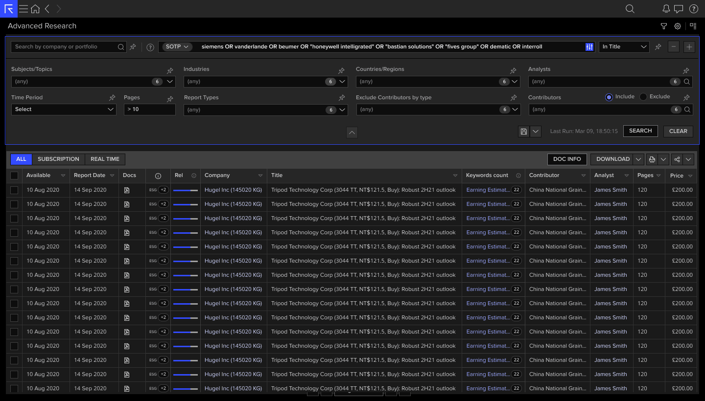
Filter panel — all 8 dimensions visible: Subjects, Industries, Countries/Regions, Analysts, Time Period, Pages (>10), Report Types, Contributors. Last Run: Mar 09, 18:50:15.
Keyword Context Preview
The most impactful change from user testing: clicking the keyword count now opens an inline preview showing exactly where the keyword appears in the document, the surrounding sentence context, and the page number — so analysts can assess relevance without opening every document. Match counts are broken down by keyword so compound queries are immediately scannable.
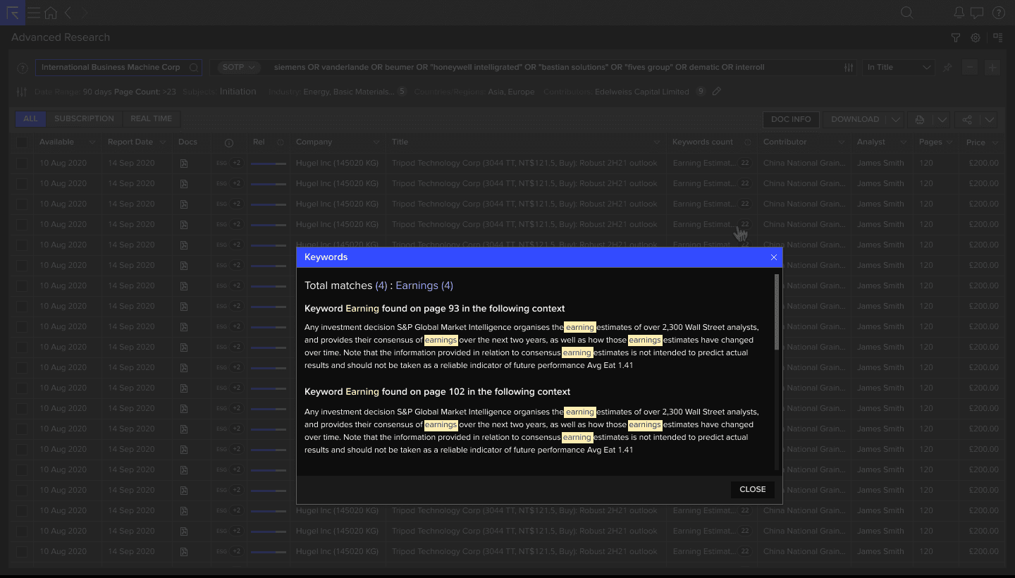
Keyword context modal — Total matches (4): Earnings (4). Shows page number and surrounding paragraph context with highlighted terms.
Column Customisation
The Settings panel — previously invisible to 60% of users — was redesigned as a persistent sidebar accessible from a clear icon in the table header. Users can now toggle 14 columns (Published Date, Available Date, Indicator, Keyword Relevance, Company, Title, Contributor, Pages, Estimate Rating, Recommendation Rating, Status, Countries/Regions, Industry, Analyst) and reorder them via drag-and-drop.
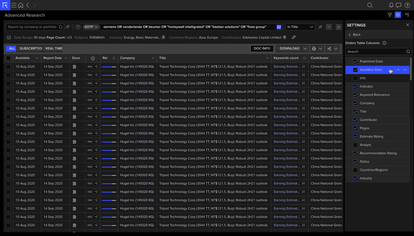
Orders Table Columns — 14 configurable columns with searchable list, toggle visibility, and drag-to-reorder. Accessible from the table header icon.
Bulk Download Actions
The Download dropdown was redesigned with three distinct, clearly labelled actions addressing the three most common analyst workflows: downloading individual files for archiving, merging reports into a single briefing document, or extracting first pages only for a rapid morning scan. The options are now the primary action on the results table, not buried in a secondary menu.
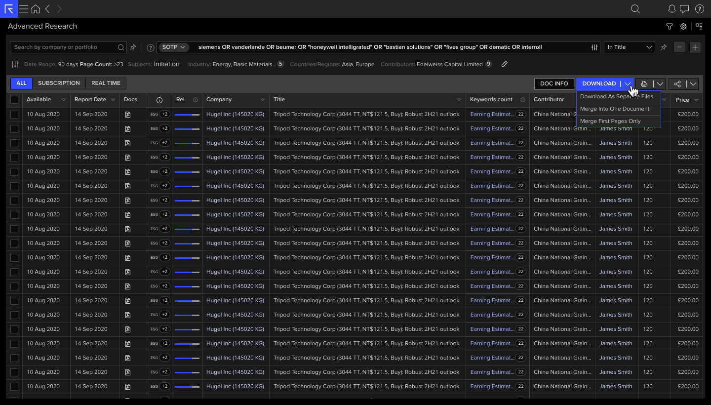
Download actions — Download As Separate Files · Merge Into One Document · Merge First Pages Only. Primary action on the results table.
06 — Outcomes & Impact
Impact across 40,000+ users
This case study presents a condensed overview. Full research outputs, design specs and interaction documentation are confidential to LSEG. Happy to walk through the complete process — get in touch.