Digital Banking Transformation
Part of Barclays' digital transformation team, I led UX across multiple initiatives — Mobile Banking, Account Opening, Identity Verification, International Payments, and Innovation. The deepest engagement was the end-to-end redesign of the mortgage experience: a project that fused rigorous user research, rapid prototyping, and a refined design language to help create the UK's most-celebrated retail banking app.
// The Challenge
A leading lender with a lagging experience
Barclays is one of the UK's foremost mortgage lenders — but the digital product didn't reflect that standing. Having navigated online mortgage applications across multiple providers firsthand, the friction was visceral: products were hard to discover, tools were buried, and the gap between customer question and confident answer was far too wide.
Existing mortgage journeys across the app felt outdated compared to competitors, with unpolished UX that eroded customer confidence at critical decision points. Our mandate: build a brand-new mortgage experience that sets the standard for usability and aesthetics — guiding customers to the right product while retaining existing relationships and converting new ones.
Hard to navigate to the right products and mortgage tools
Long wait times for adviser appointments
Excessive information entry on application forms
Lack of upfront clarity on fees and eligibility
Outdated visual design out of step with competitors
Unresolved usability issues undermining trust
The existing mortgage options experience — the starting point for our redesign
// Proposed Approach
A structured process from understanding to pilot
We structured the engagement into three phases: five weeks of deep understanding — looking in at internal workflows and looking out at competitive and customer signals — followed by three two-week design sprints alternating between prototyping and testing, then a final three-week delivery phase to prepare strategy and MVP assets before piloting with real users.
Project approach: 5 weeks understand · 3 × 2-week sprints · 3 weeks deliver · pilot
// 01 — Empathise
Getting close to the problem
Before any sketching, we needed to understand users deeply. We ran a two-day usability study in a dedicated lab with 8 real customers, observing how they navigated the existing mortgage journey and where their confidence broke down. The sessions were rich with signal: moments of hesitation, misread labels, abandoned flows.
Alongside the lab work, we ran structured user interviews and a competitor benchmarking analysis across the UK's major mortgage providers. We also visited a Barclays branch to shadow mortgage advisers — getting direct exposure to the questions customers consistently struggled to answer alone, and the manual workarounds advisers had built to compensate for the digital gap.
Research Methods
Usability lab study — 8 participants over 2 days
Structured user interviews — current and prospective customers
Competitor benchmarking analysis across major UK lenders
Branch visit — shadowing mortgage advisers in live sessions
Affinity mapping — synthesising insights from lab sessions, interviews, and shadowing
// 02 — Ideation
From insight to focused opportunity
A cross-functional workshop brought the research to life. Designers, product managers, and key stakeholders synthesised the data together and aligned on four primary focus areas: mortgage product visibility, eligibility clarity, application onboarding, and calculator accuracy. With team consensus reached, I mapped detailed customer journeys and task flows to give the ideas structural form.
Once we agreed on which solutions were worth building and testing, low-fidelity prototyping began — exploring different structural approaches to the flow before committing to high-fidelity execution. This phase was deliberately rough: the goal was to kill bad ideas cheaply.
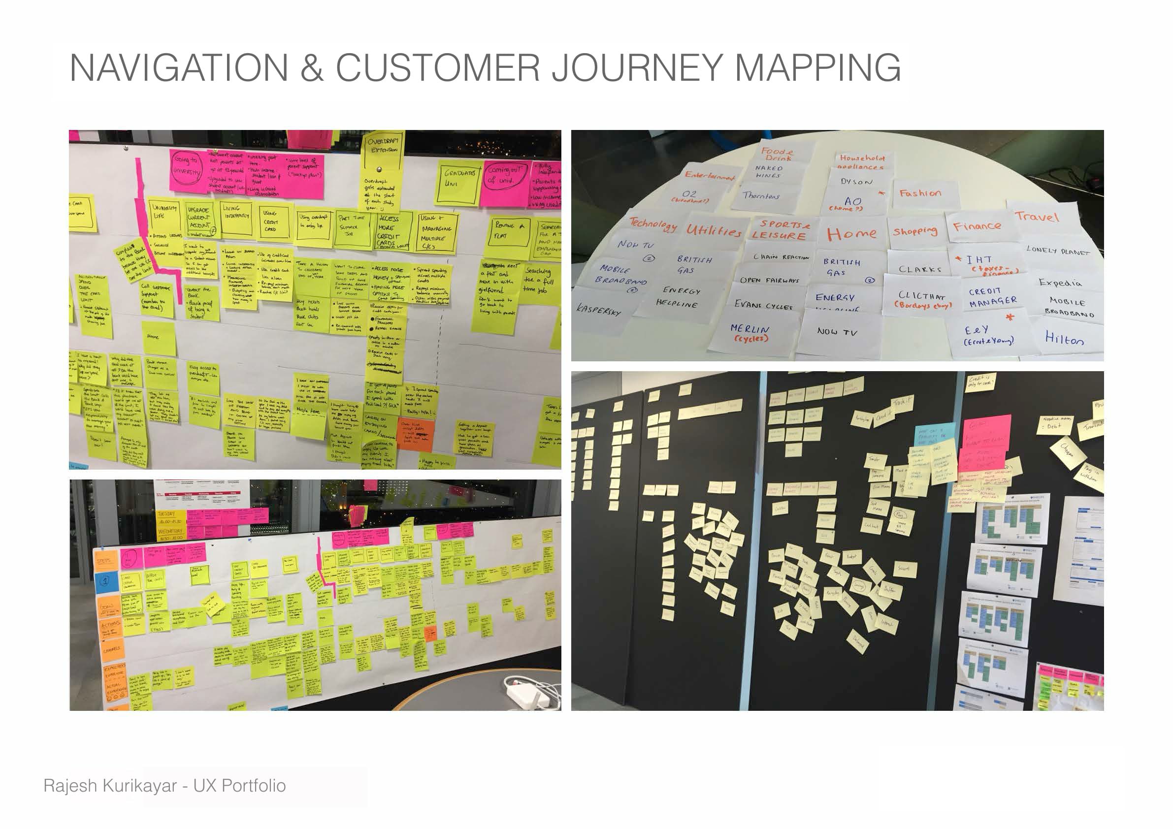
Collaborative ideation — navigation, affinity maps and customer journeys developed on the wall
// 03 — Prototyping
Test early, iterate fast
Prototypes at every fidelity level — paper sketches, interactive wireframes, and clickable mobile builds — were tested against real assumptions with real customers in the lab. The XO process flow and mortgage calculator interaction were sketched and mapped extensively, testing assumptions around affordability inputs, product surfacing, and application step structure.
Each round surfaced something valuable: users wanted key information available before committing to the application, mortgage terminology needed plain-language reframing, and document upload was strongly preferred over manual data entry. Two full rounds of iteration brought us to a design stable enough to carry into high-fidelity.
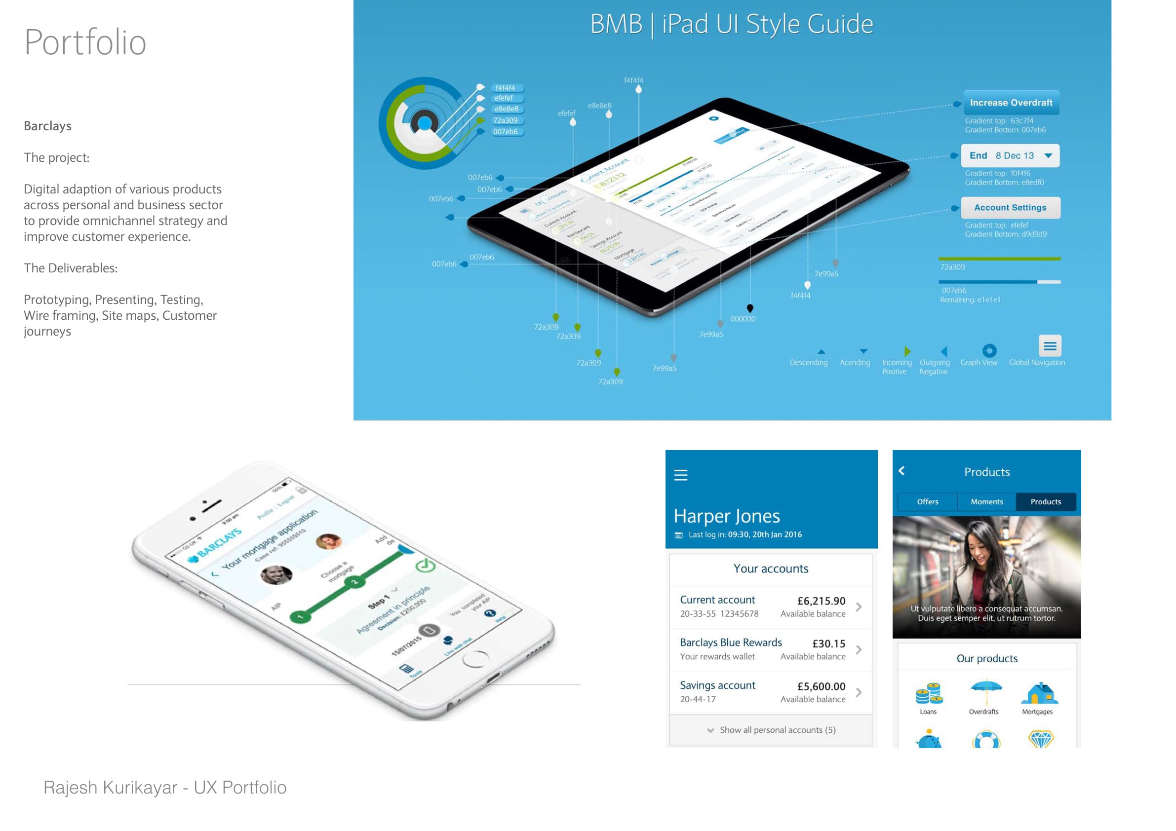
Cross-device prototyping — translating complex banking journeys across tablet and mobile
// 04 — Design
Clarity at every step
Working closely with a UI designer, we finalised a mobile-first responsive design that extended the Barclays design system while pushing its aesthetic ambition. The core challenge was compressing a complex, multi-stage mortgage journey into a flow that felt effortless — achieved through progressive disclosure, smart defaults, plain-language guidance, and contextual help woven directly into the experience.
The mortgage calculator became the centrepiece of the redesign — a tool that demystified affordability and served as the natural entry point into a guided product recommendation flow. Connecting calculator outputs directly to eligible products, and from there to an adviser via in-app chat, closed the loop between research and action without requiring a branch visit.
Mobile-first responsive wireframes and high-fidelity designs
iOS and Android native UI — extending the Barclays design system
Redesigned mortgage calculator with eligibility outputs
In-app adviser chat integration with contextual triggers
Document upload flow replacing form-heavy data entry
Motion design and micro-interaction specifications
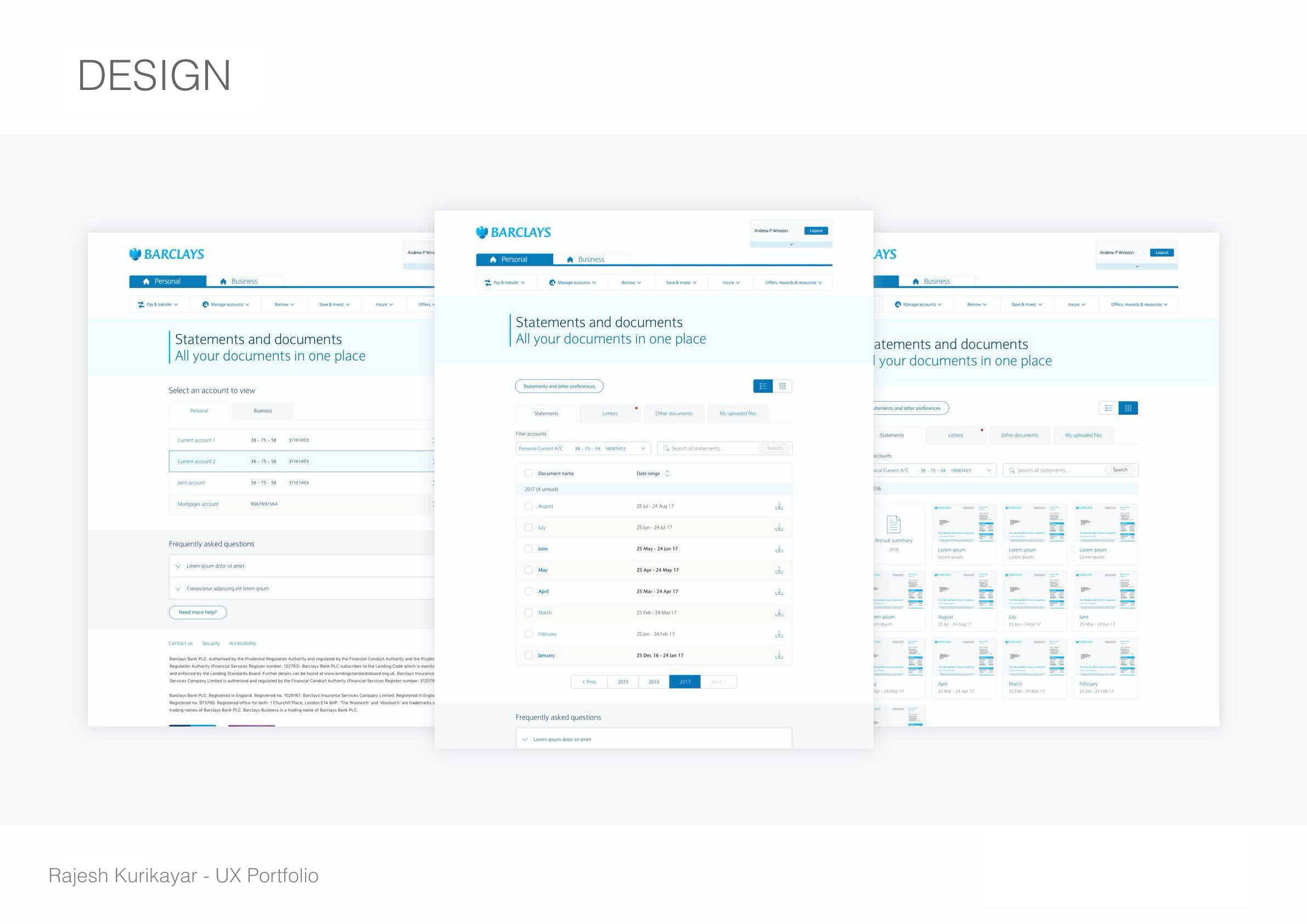
Final high-fidelity design — a consistent, responsive experience across the Barclays platform
// Outcomes
Industry recognition and a unified platform
Mobile-first responsive experience delivered
A new mobile-first design delivered across web, iOS and Android — combining the core mortgage experience with tools and expert adviser access across every touchpoint.
Unified design language at scale
Extended the Barclays design system to support a consistent, accessible banking experience across personal and business banking — eliminating the patchwork of inconsistent patterns.
Mortgage calculator as centrepiece
The redesigned calculator and product research experience became the natural entry point — guiding users from affordability to eligible products to adviser chat without leaving the app.
Adviser capacity freed up
By enabling more customers to self-serve through the digital channel — with in-app chat for complex queries — the redesign reduced demand on branch appointments and gave advisers more time for high-value conversations.
// Reflection
Complexity, made invisible
A mortgage is one of the most consequential financial decisions a person makes — and the role of great UX in that moment isn't to simplify the decision, but to make it approachable. The friction that existed in the old journey wasn't protecting customers; it was losing them. Every drop-off was a person who didn't get the right product.
The most satisfying part of this project was how it demonstrated the value of doing research properly. Every design decision that made it through to launch had been tested. The Forrester recognition was an external validation of that — but the real measure was customers completing journeys they previously abandoned.